Last week was the last one of teaching and since then it's been a blur of exam note taking and questionable sleeping patterns.
Last Friday was also the deadline, which we all agreed upon, for any additional art assets to be accepted by the programmer. It was pretty tough getting everything finished off for then, but at the same time it was a nice bit of weight of my shoulders.
I managed to get a fair amount of animation in, although, as always not as much as I would've liked. Not in a negative, putting myself down way or anything, just that I really like the game and I feel it deserved to feel a bit more alive. But I'm still delighted with it.
Using the THIRD DIMENSION. *Vincent Price Laughter*
About half way through term I decided I wanted to try and use 3D animation to a. save me a bit of time, and b. make the animation look better, for the boat propeller.
My first attempt was a little off. The full rotation of the propeller was 30 frames...
...And I originally took frame 0,10,20,0 screenshots over to the sprite sheet. However, this ended up being pointless as the frames were so similar that it sort of looked like the propeller was twitching, rather than spinning.
So then I decided to choose the frames which were all clearly different, and hoped this would create the illusion of it spinning, as best as possible with 4 frames to play with. (The reason I didn't just render out every frame.)
And this time it looked much better, but it was out of alignment.
So then I tidied it up a bit, re-aligned the whole thing to be pixel perfect, and I had my final animated asset ready to be placed in game.
It still doesn't look great, but I'll know next time to include more frames by alpha, and I'll be much faster as implementing 3D objects into my 2D art to help streamline my workflow.
Below you can see some beta footage of Role. Unfortunately the boat animation isn't in this capture, but hopefully I'll have an updated one by submissions.
Notes/Bugs/etc.
There's still a couple of little things wrong in this video that I should probably point out.
-The rope seems to be missing from the well.
-There's a glitch which means the middle of the game is very hard to do and is extremely slow. I'm not sure why this has just started.
-The firework moves if you collide with it, which looks really odd.
But yeah, that's about all she wrote for now.
I'll be writing up my peer review for the next couple of days, and then organising my project diary, and then that's pretty much us for the first semester game.
Cheers,

art, thoughts, etc
Showing posts with label AG1165A. Show all posts
Showing posts with label AG1165A. Show all posts
Thursday, 19 December 2013

Thursday, 21 November 2013
Play Test (Alpha)
Yesterday was a cool day.
After weeks of working on our own games, we all went around and playtested each others'.
One thing that really stood out was the diversity of the games. The fact that I could go from game-to-game-to-game and not see one pirate or zombie, or whatever, was such a delight. So I really hope the feedback I gave to the few games I actually managed to play will be helpful.
As for Role, I was happy that, although the game was praised, the other developers were being critical and clearly wanted to help make our game better.
Critical/Negative Feedback.
- How did I get the points?
- Was stuck at the dominoes for a while. Although that's not really a complaint
- Not much gameplay
- Didn't quite understand why I failed at the house/elevator part.
- The final part of the level drags on.
Things to note.
- Over-tapping often.
- Focus on the moon means people don't notice the lanterns which lay in the grass.
So I'll just quickly address these points.
- How did I get the points?
This is an obvious problem straight away when you start the (alpha) game. This all comes down to the polish of the player reward system. The placement of the lanterns is another reason. At the moment the lantern positions are very punishing in the way that you either get no points if you don't understand what's going on, 10 points occasionally, 20 points if you're a natural, and, well, I've had 30/30 points twice.
We're currently adding in new lanterns, and polishing the reward system. At the moment the score system works (which is all we really needed for alpha) and so we just need to make it clearer than some small number in the top corner. We're certain that after these improvements have been implemented the objectives will become much clearer.
- I Was stuck at the dominoes for a while.
This was something I loved watching. One of the developers tried and tried to get past the windmill launch part, and kept falling short because they were out of sync with the windmill blades. After about 4-5 tries he clicked going up the elevator and realised he could time the collision. This was a total thrill to watch, as he managed it first time upon realising this. Because time is supposed to be a crucial element in this game, it was just great to see someone understand this and go on to complete the challenge.
- Not much gameplay & The final part of the level drags on.
With great game design, comes great gameplay. This one came as no surprise, although it was less frequently mentioned than I had predicted. We're going to cut out the long rolling sequence towards the end of the level very soon. Because this section leads up to the (likely) drop into the ditch, which is already horseplay, it's like a double whammy of "Seriously..?" It also comes straight after the difficult lantern/catapult section which people can miss first play through. So this awkward gap in gameplay becomes overt. Although I think it should be noted that I don't think this would be an issue if the moon was say a character you controlled. There are many long running sequences in Limbo which totally fit with the whole exploration side of the game. But the input makes it acceptable. Because our moon rolls independently it's a drag.
- Didn't quite understand why I failed at the house/elevator part.
Same issue at the dominoes one above.
In summary, I'm optimistic about the currently trajectory of the game, and looking forward to addressing the issues my fellow devs had. At the same time though, we don't want to make the game too obvious or patronising; and so we won't pander too much to the players' first few tries - great games rarely do; and we can hopefully make something that stands out by remembering this.
(Some of the) Positive feedback.
- Awesome art style. (I can sleep easy)
- Paces well.
- Music & atmosphere immersed me in the experience
I guess I don't have too much to say about this. I love that people are getting into the game, and enjoying it for the reasons we are aiming for. For now we'll just keep our heads down.
Cheers for now,
After weeks of working on our own games, we all went around and playtested each others'.
One thing that really stood out was the diversity of the games. The fact that I could go from game-to-game-to-game and not see one pirate or zombie, or whatever, was such a delight. So I really hope the feedback I gave to the few games I actually managed to play will be helpful.
As for Role, I was happy that, although the game was praised, the other developers were being critical and clearly wanted to help make our game better.
Critical/Negative Feedback.
- How did I get the points?
- Was stuck at the dominoes for a while. Although that's not really a complaint
- Not much gameplay
- Didn't quite understand why I failed at the house/elevator part.
- The final part of the level drags on.
Things to note.
- Over-tapping often.
- Focus on the moon means people don't notice the lanterns which lay in the grass.
So I'll just quickly address these points.
- How did I get the points?
This is an obvious problem straight away when you start the (alpha) game. This all comes down to the polish of the player reward system. The placement of the lanterns is another reason. At the moment the lantern positions are very punishing in the way that you either get no points if you don't understand what's going on, 10 points occasionally, 20 points if you're a natural, and, well, I've had 30/30 points twice.
We're currently adding in new lanterns, and polishing the reward system. At the moment the score system works (which is all we really needed for alpha) and so we just need to make it clearer than some small number in the top corner. We're certain that after these improvements have been implemented the objectives will become much clearer.
- I Was stuck at the dominoes for a while.
This was something I loved watching. One of the developers tried and tried to get past the windmill launch part, and kept falling short because they were out of sync with the windmill blades. After about 4-5 tries he clicked going up the elevator and realised he could time the collision. This was a total thrill to watch, as he managed it first time upon realising this. Because time is supposed to be a crucial element in this game, it was just great to see someone understand this and go on to complete the challenge.
- Not much gameplay & The final part of the level drags on.
With great game design, comes great gameplay. This one came as no surprise, although it was less frequently mentioned than I had predicted. We're going to cut out the long rolling sequence towards the end of the level very soon. Because this section leads up to the (likely) drop into the ditch, which is already horseplay, it's like a double whammy of "Seriously..?" It also comes straight after the difficult lantern/catapult section which people can miss first play through. So this awkward gap in gameplay becomes overt. Although I think it should be noted that I don't think this would be an issue if the moon was say a character you controlled. There are many long running sequences in Limbo which totally fit with the whole exploration side of the game. But the input makes it acceptable. Because our moon rolls independently it's a drag.
- Didn't quite understand why I failed at the house/elevator part.
Same issue at the dominoes one above.
In summary, I'm optimistic about the currently trajectory of the game, and looking forward to addressing the issues my fellow devs had. At the same time though, we don't want to make the game too obvious or patronising; and so we won't pander too much to the players' first few tries - great games rarely do; and we can hopefully make something that stands out by remembering this.
(Some of the) Positive feedback.
- Awesome art style. (I can sleep easy)
- Paces well.
- Music & atmosphere immersed me in the experience
I guess I don't have too much to say about this. I love that people are getting into the game, and enjoying it for the reasons we are aiming for. For now we'll just keep our heads down.
Cheers for now,
Monday, 18 November 2013
Role Meets Alpha.
So it's been over two weeks since my last (game dev) blog post, and there's much to report.
Where I left off:
- Approaching Alpha
- Compromised level design implemented.
- Asset Designs
Approaching Alpha.
We managed to hit our Alpha target which was great. I'm really happy with what we managed to get done, and with this in mind, I feel confident that we can deliver something we can stand by.
Step One: "Tap the screen to begin". The player taps and straight away they're aware that this is your input.
Step Two: You are halted by a barrier in the form of a bolt. The player taps again - the moon rolls on, and the player recognises the ability to alter the environment, not the moon. In addition, there seems to be a lantern hovering just above this bolt. Hmm.
Step Three: The player again taps to be moved up the lift and is then thrown onto a pulley system by a windmill, and the cause and effect notion is first witnessed. The player sees an object propelled across the screen. If the player taps then two lanterns float up into the sky. If these are released at the correct times the player can take them out, gaining a score of 10 for each one. Ah, the lantern at the beginning makes sense now.
Step Four: The ending to the level is something I really think turned our great (with regards to gameplay). At the moment the art for it really sucks, but bear with me - it's just alpha*.
So at the end of the level the moon is rolling along in the grass, and there appears to be nothing in sight.
And then you drop into a ditch.
This mechanism I feel is our biggest nod to Limbo. You re-spawn a short distance back, immediately. So the player knows they have to do something between this point and the ditch. So they tap again. They might tap straight away, at which point the spring comes to light, and it becomes clear how to get over the ditch.
And then you fly under the firework display into (currently) oblivion. There will be a layer of trees at this section and the player will be re-spawned at the same point as the ditch death.
You then need to tap again, and eventually the player figured out that you have to tap to spring the moon at the right time, to land in the firework display, to then tap again at the right time to set off the firework and tow the moon into the sky, thus completing the level as the moon transforms into the sun and turns the night into day. The players' score is then displayed.
I feel this final mechanism works well as a final challenge as it allows us to demonstrate the idea of time as a crucial skill element in the game, and in terms of difficulty is by far the most difficult task in our little level.
Thanks,
*For Alpha the quality of the art was no important. we merely need to be certain it could be programmed in to the game. The actual artwork can begin to be implemented now.
Where I left off:
- Approaching Alpha
- Compromised level design implemented.
- Asset Designs
Approaching Alpha.
We managed to hit our Alpha target which was great. I'm really happy with what we managed to get done, and with this in mind, I feel confident that we can deliver something we can stand by.
 |
| Promotional Composition |
So the above image is something I put together quickly to demonstrate the games' ethos in one image for reference/presentations etc.
Below you can see a quick screen recording I took of our Alpha. As it is Alpha gameplay footage, the animations and assets in general are still to be refined. There's merely "Something" there for every asset we will have in beta. By beta the game will play and appear much stronger. Also a lot of the assets are slightly out of position, which may cause the footage to be slightly confusing first time round.
 |
| Final Boat Asset. |
Compromised Level Design Implemented.
I don't think I generally need to go into this part of the development, but I'll say a bit about it anyway because I love the theory behind it.
Below is the template of the level we had to quickly devise the other week. I'm no expert level designer, but I'm quite delighted at how it turned out.
We decided to blend the game's tutorial into the beginning of the level. Because we've been going for the whole simplistic/expressive approach throughout, it made sense not to clutter the game with words and diagrams. Afterwards, the player is introduced to the cause and effect nature which is where we had originally hoped the level design would evolve around.
 |
| The Level Template I worked from. |
Step Two: You are halted by a barrier in the form of a bolt. The player taps again - the moon rolls on, and the player recognises the ability to alter the environment, not the moon. In addition, there seems to be a lantern hovering just above this bolt. Hmm.
Step Three: The player again taps to be moved up the lift and is then thrown onto a pulley system by a windmill, and the cause and effect notion is first witnessed. The player sees an object propelled across the screen. If the player taps then two lanterns float up into the sky. If these are released at the correct times the player can take them out, gaining a score of 10 for each one. Ah, the lantern at the beginning makes sense now.
Step Four: The ending to the level is something I really think turned our great (with regards to gameplay). At the moment the art for it really sucks, but bear with me - it's just alpha*.
So at the end of the level the moon is rolling along in the grass, and there appears to be nothing in sight.
And then you drop into a ditch.
This mechanism I feel is our biggest nod to Limbo. You re-spawn a short distance back, immediately. So the player knows they have to do something between this point and the ditch. So they tap again. They might tap straight away, at which point the spring comes to light, and it becomes clear how to get over the ditch.
And then you fly under the firework display into (currently) oblivion. There will be a layer of trees at this section and the player will be re-spawned at the same point as the ditch death.
You then need to tap again, and eventually the player figured out that you have to tap to spring the moon at the right time, to land in the firework display, to then tap again at the right time to set off the firework and tow the moon into the sky, thus completing the level as the moon transforms into the sun and turns the night into day. The players' score is then displayed.
I feel this final mechanism works well as a final challenge as it allows us to demonstrate the idea of time as a crucial skill element in the game, and in terms of difficulty is by far the most difficult task in our little level.
Thanks,
*For Alpha the quality of the art was no important. we merely need to be certain it could be programmed in to the game. The actual artwork can begin to be implemented now.
Friday, 1 November 2013
First Pass level design in place.
After 6 weeks of waiting interesting level designs we (Skully and I) finally decided to just sit down and decipher one which we could make in the remaining time as best we could.
I had previously created a critical framework for our designer which in theory would facilitate more relevant and dynamic level design for Role.
Framework (apply these questions to every mechanism design once it's been made.)
-Does it consider time as a skill? Y/N
-Is this design simple enough for the player to conceive? Y/N
-Consider how the design will simulated through 2D physics.
-Does the mechanism fit the context? Y/N
-Consider the amount of work required to create it. Clever, simple designs are the core charm of this short project.
Also, the games we highlighted as our main inspirations back in week one were written down for her as she hadn't checked them out despite our teams' regular referencing to them. Pretty unsettling.
 |
| We refer to Limbo every day. Play Dead, 2010. |
As I think I mentioned before that the level designs we were receiving totally jarred with the ethos of the game and obviously hadn't been considered for any length of time as she would change them and scribble different designs on a whim while pitching them.
I really hope noting these points doesn't seem unprofessional but it's generally just a play-by-play of events.
So we still needed a final design and the ones she was bringing us all neglected to consider the fact that the mechanisms are on their own layers and so, for example, some mechanisms could not impact others. She was looking at the game like a 2D picture instead of considering the level like a 3D space.
So I quickly threw together a simple mock-up of part of our level to demonstrate how to picture it when designing (See Below).
This seems to have helped her a lot.
We now have an ending to the first pass level design and I will be creating the assets as fast as I can until the submission.
One interesting thing about the beginning of our level is the "fan" which begins to blow the player once the screen is tapped.
The context for this is a boat's propeller. Basically the start of the level will be at the water's edge and the boat will be dangling from a crane with the propeller's exposed.
Animated sprite sheets are in our beta version plan. However, I'll still make the sprite sheets so that they're ready for implementation when we're in beta development.
In anticipation of the sprite sheet I decided to create some 3D reference footage for the propeller because I don't fancy the idea of animating the side-view of a boat propeller from imagination.
So I'll begin rotoscoping that footage after I've made all the Alpha art for this level.
I've also spent some time designing the boat that will be attached to the propeller.

I took some inspiration from Ian's McCue's work and from the Junk boats of Ancient China for the shape and for the colours I referred back to my older boat design. Although I don't think they gel as well as in the older design, and in general I feel the designs are very weak; so I'll need to refine that.
I also threw the Player (moon) in to demonstrate the scale of the designs.
Also, any opinions on the current stance of the logo would be appreciated.

There were quite a few designs I drafted which I liked. But some didn't fit the context - like this one:

Tuesday, 29 October 2013
"Role" Concept Art & Visual Style Guide
Seeing as I couldn't start work on our level, I've spread out my time developing the visual style of the game, researching other styles, and creating a brief visual style guide.

I've also just sent over some first pass art to our programmer as we want to have something that looks good for our Thursday meetings, and we can't wait any longer.
I asked our producer to email Ken to ensure him that we're not lazy or unenthusiastic. Skully, Anthony, and myself are all extremely excited about this game, and are determined to not let this affect our final product. He tells me he sent the e-mail so they now know why we might not have been delivering excellent progress each week.

.png) |
| Original Mock Up |
 |
| Second Mock Up |
Visual Style Guide
Computer Game Development Project
 |
| Working Logo |
Introduction
In this document the
visual style and artistic requirements necessary for the accurate creation of
the game project “Role” will be defined.
Role is a 2D Rube Goldberg inspired
side-scroller. It is very interested in creating a simple, engaging experience
which drifts between soothing and urgent gameplay.
Role is the story of day into night.
The game begins when the moon falls from the sky directly into the level. The
character moves independently, and the player must tap the screen to alter the
game environment in order to vehicle the moon to the end of the level, at which
point the moon rises as the sun and the level is complete.
The visual style will serve the
simplicity of the game and support the games’ context to fully play to the
story of the gameplay. The artwork should also complement the idea of stillness
in the game.
Characters
The only “character” in the game is the
moon. The Moon will have a wisp-like texture and should have a sense of “life”
to it. Much like the character in “Thomas was Alone”, the animation and sound
design will compensate for the simplicity of the characters’ design.
Storyboards
User Interface
Because Role is
designed to be a simple, calming game, the UI must therefore mimic this, and
must not exist to bother or distract the player in any way.
Environments
The environment art
for Role is the majority, and as such is incredibly important in affirming the
atmosphere and ethos of the game as a whole. Primary colours have no place in
this game; Rather, a de-saturated colour scheme based around highlights has been
created to give the game the feeling of “sitting round the camp fire”. The
player should hopefully feel unsure about the environment, but also intrigued.
Overall, the environment assets should combine to instil a strong sense of
nature and history.
Man’s presence in
this world should feel minimal and also rustic. Modern technology would jar
with the organic shapes and remove the environments’ sense of innocence.
To best emphasise
the bitter cold and stillness of the night, blue hues have been used generously
across the environments. By creating this strong atmosphere at all times, the
rising of the moon to the sun at the end of each level should be a great
contrast of visuals upon which to end on.
Shape
Shape theory is a
strong influence on the narrative and impression of the character and
environment art.
The main character, the moon, is a circle,
and as such the design can better emphasise the situation or position of the
character through a harmony or dissonance of shapes.
 |
| SAFE! |
In the image above
the repetition of circles enforces the idea that the player is currently early
on in the level, the shapes are all relatively rounded and there are little or
no sharp, threatening lines. The moon almost looks like it belongs in this environment
because it harmonises with the shapes in the environment. When placed among
sharp objects however, the player will definitely not feel safe.
Camera
Camera
Role will have a parallax system which
will complement the art enormously. Games such as Rayman Jungle Run and Limbo
served as inspiration for the considering of the scale and ambience which great
parallax art can convey.
The background art of the environment
should not distract from the detail of the midground. It should complement the ambiguous
setting of the game and, like Limbo, help give a sense of remoteness to the
world.
A zooming action also exists throughout the level, which will
help draw attention to different parts of the environment and its mechanisms.
References
References
 |
| Placement Art |
The images compiled
in the mood board convey the sort of atmosphere that Role hopes to accomplish.
The still from La Luna (Pixar, 2012) in the top left of the board demonstrates
the still, calming nature of the moonlight. Stills from Rime, The Secret of Monkey
Island, and Project 2 (3 middle images) illustrate the impression which can be
captured through highlights and contrast.


Monday, 28 October 2013
ROLE!
There's been a lot of progress since my last post for Games Dev. Although not as much as we would have liked.
We are planning to be in our alpha stage by the end of this week. However, there has been a massive delay in our level design. We're currently in week six and we don't have any final designs.
There's only one level...
So far, all of them have been extremely convoluted and seemingly indifferent to the game's narrative, setting and ethos.
Unfortunately this shows little sign of improving any time soon. I suggested "Level Up" and a designer from another team suggested "The Hows and Whys of Level Design" among other things, and was kind enough to demonstrate some simple examples in a matter of minutes, which were simple, great, and captured the nature of the premise wonderfully.
I've been doing my best to create assets, but we don't have the final asset list for even the first 15 seconds of the first (and only) level. Yes, there has been a list of mechanisms provided. But anyone could have done this. It's just a generic list of Rube Golberg/LBP items with no context or hint of clever cohesion in terms of the development of the players' enjoyment.
Our programmer is working tirelessly, doing fine work, and also doing his best to test his progress with the level designs that we've been given. I really can't speak highly enough of him.
I have created a visual style guide and defined many asset designs (as best I can, which I feel fit the context) and environments. However, I am very wary to begin working on assets, when I have no idea which will make it in, and not even as polish, but as BASIC level assets.
The basic level should have been completed within the first 2 weeks with time to spare, and I should have been able to hit the ground running with the asset creation. However, we find ourselves in week 6, and even if I found out exactly what I needed to create today, I'll likely become very stressed (unnecessarily) to get it done in time.
I feel this game is a level designers' dream and I've fallen in love with the whole idea. I really want to deliver with this game and make a great impression upon my peers. However, I feel (and I am not alone here), that we may just be rather unfortunate.
I can't write this post without addressing the language barrier, because it is naturally playing a key role in this lack of progress. Most of the time when one of us is trying to explain something to the designer, she says she understands, when clearly this is not the case, as she will go quiet and then move onto another problem. The original problem is then left unsolved. The cycle continues.
So perhaps the language barrier is more to blame for the lack of understanding. But at the same time, the concept art, mock-ups and mood boards convey the context, and Skully's (programmer) physics tests and mechanic mock ups crystalise the properties and physics of the game.
From there it's just applying basic level design theory to it, and then iterating.
Naturally, this has me really worried, as our game is faltering. But hopefully we can find a solution soon and save our end product.
Thanks,
We are planning to be in our alpha stage by the end of this week. However, there has been a massive delay in our level design. We're currently in week six and we don't have any final designs.
There's only one level...
So far, all of them have been extremely convoluted and seemingly indifferent to the game's narrative, setting and ethos.
Unfortunately this shows little sign of improving any time soon. I suggested "Level Up" and a designer from another team suggested "The Hows and Whys of Level Design" among other things, and was kind enough to demonstrate some simple examples in a matter of minutes, which were simple, great, and captured the nature of the premise wonderfully.
I've been doing my best to create assets, but we don't have the final asset list for even the first 15 seconds of the first (and only) level. Yes, there has been a list of mechanisms provided. But anyone could have done this. It's just a generic list of Rube Golberg/LBP items with no context or hint of clever cohesion in terms of the development of the players' enjoyment.
Our programmer is working tirelessly, doing fine work, and also doing his best to test his progress with the level designs that we've been given. I really can't speak highly enough of him.
I have created a visual style guide and defined many asset designs (as best I can, which I feel fit the context) and environments. However, I am very wary to begin working on assets, when I have no idea which will make it in, and not even as polish, but as BASIC level assets.
The basic level should have been completed within the first 2 weeks with time to spare, and I should have been able to hit the ground running with the asset creation. However, we find ourselves in week 6, and even if I found out exactly what I needed to create today, I'll likely become very stressed (unnecessarily) to get it done in time.
I feel this game is a level designers' dream and I've fallen in love with the whole idea. I really want to deliver with this game and make a great impression upon my peers. However, I feel (and I am not alone here), that we may just be rather unfortunate.
I can't write this post without addressing the language barrier, because it is naturally playing a key role in this lack of progress. Most of the time when one of us is trying to explain something to the designer, she says she understands, when clearly this is not the case, as she will go quiet and then move onto another problem. The original problem is then left unsolved. The cycle continues.
So perhaps the language barrier is more to blame for the lack of understanding. But at the same time, the concept art, mock-ups and mood boards convey the context, and Skully's (programmer) physics tests and mechanic mock ups crystalise the properties and physics of the game.
From there it's just applying basic level design theory to it, and then iterating.
Naturally, this has me really worried, as our game is faltering. But hopefully we can find a solution soon and save our end product.
Thanks,
Friday, 4 October 2013
The Computer Game Development Project and Keeping it Simple.
The Computer Game Development Project is the heavyweight module of the Games Development Course. Spanning three semesters it consists of two University briefs, and ultimately, one professional client brief.
The module is not so much interested in your area of discipline, per se; rather the accuracy and focus in which you pertain to the exact overall design aim of the group, and the avoidance of personal work/style habits which may not serve to benefit the clients' wishes.
So far we've been placed into groups and assigned desks.
The brief for this semester is to create a game inspired by the following:
Impact
A New Day
The Few
We had an excellent brainstorming session yesterday morning in which we watched a ton of gameplay videos of recent games we each admired and that consisted of innovative mechanics and distinct art styles.
Naturally, because the game is to be completely by January, keeping things simple and straight-forward is crucial.
A game I suggested for inspiration which I felt captured this essence were:
So in ARITM you play as Zu as you travel through a cleverly rendered pixel-art world on his trusty (seemingly rotoscoped) horse. The fact that this is one of my favourite mobile games says a a lot about the gameplay and visual design because normally pixel art games, on a purely aesthetic level, do not grab my attention, and sort of get "thrown in the pile".
The game begins in the woods and as you would imagine ends in the mountains. Throughout the game you experience a full day cycle and as such this allows the game a great sense of scale and adventure. The night-time scenes especially, harness a very fresh colour palette, which translates very confidently into the pixel art. Unlike many pixel-art games which, in terms of artistic style, can come across very poorly due to a poor understanding of colour theory and pixel-art fundamentals.
The gameplay revolves the usual "angry birds" slingshot mechanic (and this does feel great on the iPad's large screen). However, where the game comes into its own is through its added dynamics of this mechanic, and others.
To start off with, almost the entire game is a frantic gallop, and as such grants it a very urgent, immediate feel. Which is awesome because this gives the player a strong sense of purpose. You don't get the chance to put it down. The player can also tilt the device to speed up and slow down. As the enemies circle around the player this becomes an exciting addition to the game play and also a nice balancing act of dodging and striking.
The Art
Colour, Scale,
Colour (and mood) plays a strong role in this game and at times reminds me of the critically applauded "Swords & Sworcery". As I touched on before, the desaturated colours emphasise the grandeur and importance of the games narrative. This is no place for primary colours in this game. Except for the bright red horse of course, which acts as a great contrast to the environment throughout.
Game Ideas.
So the game idea was a fusion between my own idea, and the idea of our programmer.
So because we only have a few weeks to not just create this game, but hopefully apply some level of polish, we took a very a "Less is more" approach to both the game design and proposed art style.
Basically we all admired the cleanliness of games like ARITM, and in turn wanted our game to also have a sophisticated, fresh feel to it.
The gameplay transpires from the Rube Goldberg idea of cause and effect mechanisms. The games' character will move independently and it will be up to the player to alter the Goldberg influenced environment to correctly guide the character to the end of the levels.
Their is only one "character" in the game at the moment.
-The Moon.
At the beginning of the levels you see the moon resting in the sky. The player witnesses the Moon fall from the sky into the level - and the game begins.
The goal is to clear a path to allow the moon to roll effortlessly through the level and rise as the sun upon completion.
As for the length of the levels, that remains to be decided. And our designer is currently working on creating interesting level structures.
There are a few artistic methodologies/theories that I would like to consider for the art creation and level design of the game.
The first one stems from a diagram in Chris Solarski's book "Video Game Art and Drawing Fundamentals", which notes the idea of harmony and dissonance in video games.

“Soft, rounded shapes are the obvious choice for designing an environment of natural, organic beauty. But you need an element against which to measure this beauty”
I feel this could benefit our levels as our character is simply... a circle. And it would quickly become obvious the sense of dissonance if our environment began to evolve as the levels progess.
So for the past few days I've been experimenting with visuals styles and shapes to try and find a nice environment for our games' context.
So aside from the moon, everything else is purely for test purposes - nothing close to finished.
Also the "Move" is just a working title I came up with. More on that later.
I think that should do it for now,
more to come soon.
The module is not so much interested in your area of discipline, per se; rather the accuracy and focus in which you pertain to the exact overall design aim of the group, and the avoidance of personal work/style habits which may not serve to benefit the clients' wishes.
So far we've been placed into groups and assigned desks.
The brief for this semester is to create a game inspired by the following:
Impact
A New Day
The Few
We had an excellent brainstorming session yesterday morning in which we watched a ton of gameplay videos of recent games we each admired and that consisted of innovative mechanics and distinct art styles.
Naturally, because the game is to be completely by January, keeping things simple and straight-forward is crucial.
A game I suggested for inspiration which I felt captured this essence were:
A Ride Into The Mountains. - Chia-Yu Chen and Lee-Kuo Chen
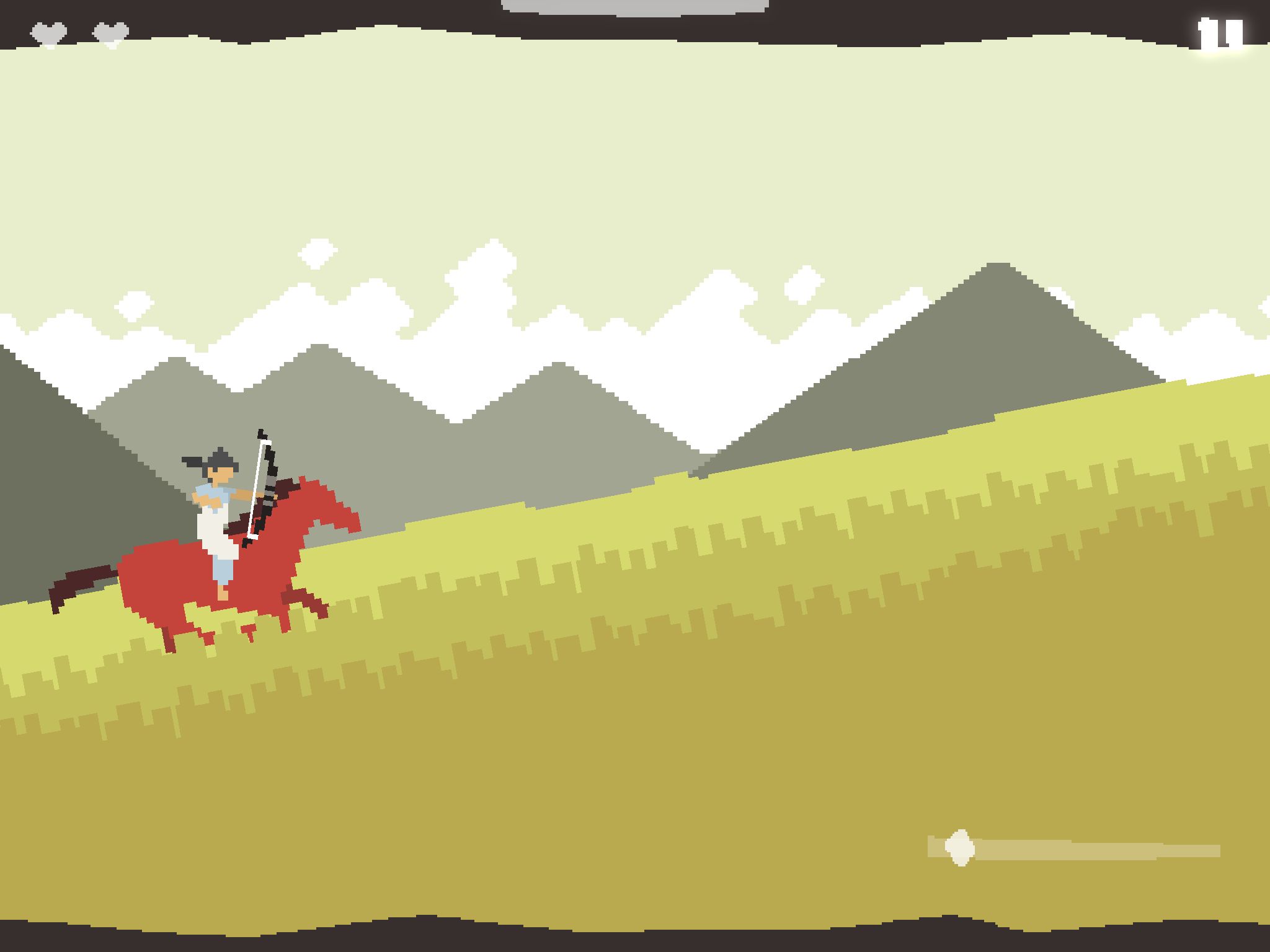 |
| the beautifully fresh and tranquil visuals of ARITM go over great on tablet. |
A Ride Into The Mountains is one of my favourite short games. As a demonstration of what can be done in mobile games in regards to keeping things simple, while demonstrating a high standard of "fun" it succeeds, for me, in many aspects.
The Game
So in ARITM you play as Zu as you travel through a cleverly rendered pixel-art world on his trusty (seemingly rotoscoped) horse. The fact that this is one of my favourite mobile games says a a lot about the gameplay and visual design because normally pixel art games, on a purely aesthetic level, do not grab my attention, and sort of get "thrown in the pile".
The game begins in the woods and as you would imagine ends in the mountains. Throughout the game you experience a full day cycle and as such this allows the game a great sense of scale and adventure. The night-time scenes especially, harness a very fresh colour palette, which translates very confidently into the pixel art. Unlike many pixel-art games which, in terms of artistic style, can come across very poorly due to a poor understanding of colour theory and pixel-art fundamentals.
The gameplay revolves the usual "angry birds" slingshot mechanic (and this does feel great on the iPad's large screen). However, where the game comes into its own is through its added dynamics of this mechanic, and others.
To start off with, almost the entire game is a frantic gallop, and as such grants it a very urgent, immediate feel. Which is awesome because this gives the player a strong sense of purpose. You don't get the chance to put it down. The player can also tilt the device to speed up and slow down. As the enemies circle around the player this becomes an exciting addition to the game play and also a nice balancing act of dodging and striking.
The Art
Colour, Scale,
Colour (and mood) plays a strong role in this game and at times reminds me of the critically applauded "Swords & Sworcery". As I touched on before, the desaturated colours emphasise the grandeur and importance of the games narrative. This is no place for primary colours in this game. Except for the bright red horse of course, which acts as a great contrast to the environment throughout.
Game Ideas.
So the game idea was a fusion between my own idea, and the idea of our programmer.
So because we only have a few weeks to not just create this game, but hopefully apply some level of polish, we took a very a "Less is more" approach to both the game design and proposed art style.
Basically we all admired the cleanliness of games like ARITM, and in turn wanted our game to also have a sophisticated, fresh feel to it.
The gameplay transpires from the Rube Goldberg idea of cause and effect mechanisms. The games' character will move independently and it will be up to the player to alter the Goldberg influenced environment to correctly guide the character to the end of the levels.
Their is only one "character" in the game at the moment.
-The Moon.
At the beginning of the levels you see the moon resting in the sky. The player witnesses the Moon fall from the sky into the level - and the game begins.
The goal is to clear a path to allow the moon to roll effortlessly through the level and rise as the sun upon completion.
As for the length of the levels, that remains to be decided. And our designer is currently working on creating interesting level structures.
There are a few artistic methodologies/theories that I would like to consider for the art creation and level design of the game.
The first one stems from a diagram in Chris Solarski's book "Video Game Art and Drawing Fundamentals", which notes the idea of harmony and dissonance in video games.

“Soft, rounded shapes are the obvious choice for designing an environment of natural, organic beauty. But you need an element against which to measure this beauty”
I feel this could benefit our levels as our character is simply... a circle. And it would quickly become obvious the sense of dissonance if our environment began to evolve as the levels progess.
So for the past few days I've been experimenting with visuals styles and shapes to try and find a nice environment for our games' context.
 |
| Early Visual Development |
So aside from the moon, everything else is purely for test purposes - nothing close to finished.
Also the "Move" is just a working title I came up with. More on that later.
I think that should do it for now,
more to come soon.
Subscribe to:
Posts (Atom)