 |
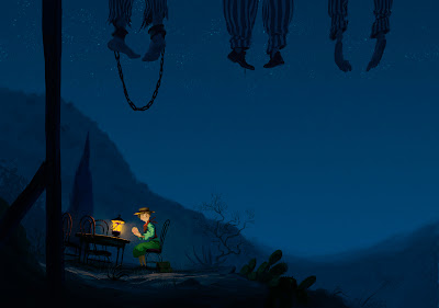
Wouter Tulp's illustration for the classic Grimm tale - " The boy who set out to learn fear."
|
you can check out his other illustrations here, they all demonstrate a fantastic consideration of character and mood that the story almost tells itself in the one image.
Here's my quick take on it.
 |
| My little take on the original. |
I adore the colour scheme of the original illustration so much. The use of lighting gives the character so much appeal and adds so much atmosphere that it's quite amazing. I'll hopefully use this colour scheme to come up with my own composition in the near future.
Research Proposal? Oh, I had a meeting with my project supervisor today, Ryan Locke. The meeting was real helpful, and Ryan helped me out with a bunch of useful links including the god-send of journal habitats, game studies.
He also cleared up some questions that were bugging me. (Can you reference videos in your literature review? Is it a good idea to do visual tests such as the ethnography one I created recently?) etc.
He also stressed that I should be doing more of the "WHY?" Something I've addressed before as being a problem. More reflection, basically, is paramount to my improvement right now.
The "Why?" behind this is quite simple. Illustration is a form of adaptation as I see it. It's the telling of a story through a series of still images. The charm of these illustrations shines through in the vision of the illustrator. Although usually illustration is mainly focused on the message and clarity, as opposed to design, it is still the act of taking a fictional "creation" and bringing it to life the way you think is best.
So although I plan to design an appropriate universe myself, I do plan to bring together the characters, props, and environments together into compiled images, which will allow the me to showcase the designs they way they would be in the final adaptation. The layout of these will be an important tasks, and so studying illustrations like these with such dynamic, appealing compositions really gives me a flavour for it.
I plan to use maya or after effects to do this. Namely, environments and characters on separate layers animated to give a sense of being present in the scene. (Similar to Atomhawk's "The Realm" trailer.)
(around the 1:12 mark)

No comments:
Post a Comment