Tuesday 18 March 2014

First Motion-Applied-to-Concept-Art Test + Audio.

For the past few days I've been working on a large environment piece for our prototype idea. Rob and I met up on Sunday and had a little work jam, which turned out to be a great idea, because he managed to get a bunch of gesture tests working, and I managed to get the majority of this painting finished:


I'm really happy with how it turned out because it conveys a lot of the core aspects of our games' environment. Aside from the general mood and colours of the environment you can also get an idea of the navigation of the game, and also the hotspots which will be in the environment.

The clouds of smoke idea was inspired by many things for navigation, such as the mountain in Journey, and the desire to not have any HUD system or traditional guiding elements.

And I'm sure I've talked about the hot spots before but to re-iterate, they are the locations around the map which will trigger the stories and songs of the appalachian people and will be the areas in which the player can interact with objects.

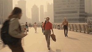
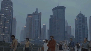
To return to my part of the project specifically, I promised to use audio and motion to give a stronger sense of the game mechanics and aesthetics within my concept art. I've applied these to this piece of concept art and I'm really happy with the end result. The motion gives a greater sense of depth, which ultimately gives a much greater impression of how it would feel to explore in a 3D space. The audio also helps this along a ton. Good ol' freesounds.

Here's the motion concept art - make sure HD is on :


Also here's some style tests and cabin designs I did too.


Sunday 16 March 2014

Mock Brief: Finished

After my first, not so successful, silhouettes for Tom's brief, I did a bit more research into Fantasy weapons, sword proportions, and such. After that I created these:


I think the improvement is pretty dramatic. That is to say, these actually look like believable swords (for the most part). After my first, not so successful, silhouettes for Tom's brief, I did a bit more research into Fantasy weapons, sword proportions, and such. After that I created these:

I got some opinions on the silhouettes from a classmate which helped me figure out the most interesting parts of the designs. After which, I went and rendered the final design. I'm much happier with the design than I thought I was going to be, although I'm still going to polish the handle a bit more and do a separate image which shows off the globe on the bottom of the sword a bit better. Because of the project I'm doing with Rob for innovation, I was in the mind set to think about how to convey maps and direct the player in interesting ways, and when I was looking to add a final kick to the design that popped into my head, and so I thought it could be cool to have the globe on the sword project a virtual map/globe of the game world if you stab it into the ground and would work best for a first-person RPG.


Tuesday 11 March 2014

Mock Brief and Maybe Speed paints aren't where it's at.

A few days after Sam and I sent off our first round of questions to Tom from Jagex, we received a hugely insightful, extensive range of answers. Tom went into detail on his professional practice, how he deals with, and adapts to different styles, and how he landed his first job in games.

On top of all of this, Tom was kind enough to provide us a mock concept art brief. The brief was to create a new weapon for a fantasy RPG game along the lines of WoW, and time restraints and other aspects were defined to simulate a truer concept art role simulation. I've done the first round of silhouettes, but I'm not too happy with them. I'm pretty embarrassed by the fact that I've never designed weapons before, really. I've perhaps done a few sketches here and there, but nothing truly *designed*.

I made the mistake of jumping into my silhouettes after only doing a small amount of research, and ended up have little ideas during the silhouettes which meant I had to go and look at other images, which then ended up eating into my time allocation for this stage of the task.


As you can see, these designs really lack any new or interesting ideas. However, I learned a ton by doing these. I had to do these to realise how easy it is to design an awful clichéd sword. Believe it or not the work above is about an hours worth. Pretty shocking considering how basic they are.

After I made these I sent them off to a friend who plays this kind of game a lot, to see if he could picture them in a game, and if so, which one.

His feedback, being an artist also, was extremely helpful and critical and really made me take a step back from the designs:

from silhouette and stuff alone i would say 3 is maybe a bit plain for epic loot. im sure ive seen 6's shape, or similar shapes, used somewhere for like the horde side when i played wow goddamn ages ago. Thing is, even though its got that orcy-crafted look you could still make it look like epic loot with seals and glowing sigils and whatever. I think a lot of the handles are a bit thick in relation to the blades. I just looked at wow there and the handles are fairly normally proportioned to a hand compared the mental style of the rest of the sword. I think you could play with more interesting shapes for the actual blades, instead of having those pointy bits sticking on (2+4) just because it looks structurally weak. You could do that but keep the overall idea there, like number 1 being 2 seperate blades back to back. Also could try rough colours if you like an idea, if you're wanting effects and stuff

So for my next iterations I'm going to bear all this feedback in mind, and do much more research into exactly the sort of personality/heritage I want to the sword to have, and hopefully have a much more visually appealing design.

Speed painting.

I've become disillusioned with the idea of spit paints. At least for now, while I'm learning how to do polished art for a portfolio. It's becoming increasingly frustrating to create truly interesting, original pieces when I'm still very much trying to find my footing (in the grand scale of things). I think these spit paints might be more suited to people who've been in industry for a while, and are more experienced. From now on I'm going to focus more on the *painting* and not the speed at which the painting comes about. Obviously the speed is an important aspect, but I don't think it should be at the forefront of my mind when I haven't even started my career.

Monday 10 March 2014

Complementing Projects

There's been some big developments in the scope of this project since my last post, to say the least.

The new plans have all been green lit though, so that's the main thing.

The new project is a collaboration between Rob and myself. Rob's project is interested in evaluating and studying the emotive connotations of hand gestures in interactive environments. And my project is interested in conveying game mechanics/dynamics/aesthetics through concept art which have been developed through study of a specific story.

Rob's project, in his words, lacked a rich context which would support his experiments; and my project lacks the production side past 2D concept art, and also would be benefitted greatly through the use of gestures, which allow a more aesthetically pleasing and interactively strong way to explore.

The context of my projects' art was to be a folk tale, but I as looked into it, the way of the Appalachian people was much more interesting in its natural heritage and nuances than the stories themselves, at least in terms of explorational potential, I felt. The folk tales of Appalachia all stem from their way of life, and are all interwoven into their environment in some way or another. So, in theory, the Appalachian hillside could act like a hub for many folk stories, which would organically be portrayed to the player, preferably avoiding the interactive design misfire - literalism.

Rob and I are currently fleshing out the Aesthetics of our game as we are interested in the MDA approach to game design.

To give Rob something to work with while I developed some more concept art, I put together two mood boards: one to detail the environment mood, and another in attempt to capture the desired aesthetic gesture relationships I think would be great to experiment the value of the game with.

Environment

Gesture Aesthetics
For tomorrows' pitch group, we had set out a to-do list that we decided would be needed to give a clear picture of what it was we wanted to do, without having to give a long-winded explanation - an elevator pitch, basically.

I've currently written a good few pages of a GDD/Project guide for us, which we'll hopefully have fleshed out a bit more by the end of the week. I'll also have a few pieces of concept art to display (below), and Rob will probably have some gestural examples, which I'm really looking forward to seeing.


Sunday 2 March 2014

Ramblings; On Inspiration; Her

It's important, as someone who works on games, to take inspiration from other media. As it stands, the emotional spectrum of games is expanding wonderfully, but the intricacies of the human condition aren't really all there yet, or at least as well as they are in, say, films or prose (Chen 2012). The emotional maturity of other media can be hugely uplifting for someone working on new games, because of the dull clichés and tropes which are rampant in games.

Her (2014)
Her is a great example of a unique, true vision being realised. I had been looking forward to it for a long time, and although I saw it over a fortnight ago, it's still very much in my thoughts. The film is special in countless ways, and even if you cast the story aside, the visual design of the film is enough to make you stop and think. 

Note: There's an incredible article focused on the colour of Her. Like the film, the writing is very expressive and visceral, and the style really helps put across the dreamy personality of the film. 

Her (2014)
I don't want to go too much into the film in the form of synopsis (that article I linked does so extremely well) instead, I just want to talk about the moods in the film, and the way it uses colour, and why I think it matters for the work I'm doing.

The western connotations of the colour red are generally well known: anxiety, danger, yada yada. Basic colour theory. But, in Her it takes on a new form; it's reborn. In a lot of the interviews and articles addressing this idea, the phrase "womb-like" seems to be the favourite attempt to verbalise the effects.

Her (2014)
Most of the interviews with the director tend to underplay the theory, shy away from the scrutiny, and basically put the whole thing down as an arbitrary creative expression. At least that's what I've taken away. And I sort of like that. Why do creative endeavours need to be contrived and thus over-analysed? Apparently, Spike Jonze, the director, is a big fan of napping, and really, even that's just enough for me to get the gist of where he was creatively when he was envisioning the aesthetics of the film.

I'm digressing slightly, but it's such a refreshing thought that I had to go off on a tangent there.

As I mentioned before, to me the red hues in Her didn't spell danger. Rather, it felt safe. And in a film which centers around isolation and loneliness, strangely it gave it a real personality - a pulse. And this feels familiar, it made what was on screen feel all the more real. And this idea starts to become really cool when you remember the plot of the film.

Blue is the Warmest Colour is another film which came out recently where the colour complemented the development of the plot really well, and like Her, it just added a ton to the lasting nature of the story. It's not something that I feel has directly influenced my work yet, but it's a task I set myself for this module to explore.


I'm going to keep these thoughts in mind while working on things for this project, and see if I can work out some sort of theme to go with my game idea. Still working on that part.

Kudos if you made it to the end of this brain vomit.

Daily Spitpaint 3


Followers