
It's important, as someone who works on games, to take inspiration from other media. As it stands, the emotional spectrum of games is expanding wonderfully, but the intricacies of the human condition aren't really all there yet, or at least as well as they are in, say, films or prose (Chen 2012). The emotional maturity of other media can be hugely uplifting for someone working on new games, because of the dull clichés and tropes which are rampant in games.
 |
| Her (2014) |
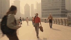
Her is a great example of a unique, true vision being realised. I had been looking forward to it for a long time, and although I saw it over a fortnight ago, it's still very much in my thoughts. The film is special in countless ways, and even if you cast the story aside, the visual design of the film is enough to make you stop and think.
Note: There's an incredible article focused on the colour of Her. Like the film, the writing is very expressive and visceral, and the style really helps put across the dreamy personality of the film.
 |
| Her (2014) |
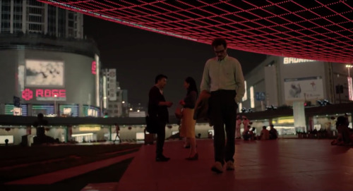
I don't want to go too much into the film in the form of synopsis (that article I linked does so extremely well) instead, I just want to talk about the moods in the film, and the way it uses colour, and why I think it matters for the work I'm doing.
The western connotations of the colour red are generally well known: anxiety, danger, yada yada. Basic colour theory. But, in Her it takes on a new form; it's reborn. In a lot of the interviews and articles addressing this idea, the phrase "womb-like" seems to be the favourite attempt to verbalise the effects.
Most of the interviews with the director tend to underplay the theory, shy away from the scrutiny, and basically put the whole thing down as an arbitrary creative expression. At least that's what I've taken away. And I sort of like that. Why do creative endeavours need to be contrived and thus over-analysed? Apparently, Spike Jonze, the director, is a big fan of napping, and really, even that's just enough for me to get the gist of where he was creatively when he was envisioning the aesthetics of the film.
I'm digressing slightly, but it's such a refreshing thought that I had to go off on a tangent there.
As I mentioned before, to me the red hues in Her didn't spell danger. Rather, it felt safe. And in a film which centers around isolation and loneliness, strangely it gave it a real personality - a pulse. And this feels familiar, it made what was on screen feel all the more real. And this idea starts to become really cool when you remember the plot of the film.
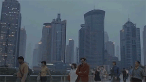
The western connotations of the colour red are generally well known: anxiety, danger, yada yada. Basic colour theory. But, in Her it takes on a new form; it's reborn. In a lot of the interviews and articles addressing this idea, the phrase "womb-like" seems to be the favourite attempt to verbalise the effects.
 |
| Her (2014) |
I'm digressing slightly, but it's such a refreshing thought that I had to go off on a tangent there.
As I mentioned before, to me the red hues in Her didn't spell danger. Rather, it felt safe. And in a film which centers around isolation and loneliness, strangely it gave it a real personality - a pulse. And this feels familiar, it made what was on screen feel all the more real. And this idea starts to become really cool when you remember the plot of the film.
Blue is the Warmest Colour is another film which came out recently where the colour complemented the development of the plot really well, and like Her, it just added a ton to the lasting nature of the story. It's not something that I feel has directly influenced my work yet, but it's a task I set myself for this module to explore.

I'm going to keep these thoughts in mind while working on things for this project, and see if I can work out some sort of theme to go with my game idea. Still working on that part.
Kudos if you made it to the end of this brain vomit.
I'm going to keep these thoughts in mind while working on things for this project, and see if I can work out some sort of theme to go with my game idea. Still working on that part.
Kudos if you made it to the end of this brain vomit.
No comments:
Post a Comment