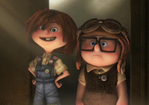
I decided to spend some time yesterday taking my sketches into a final character design paint. It ended up being a lot more difficult than I expected. Originally I ran into a few problems regarding anatomy.
The whole nature of the exercise was to create a detailed stylised character whom I had developed through preliminary sketches and studies. But I found it difficult not to pander too much to real anatomy when designing. It felt like a bit of a juggling act most of the time as I tried to play to realistic anatomy, while tuning it to fit the illustrative style I was going for and of course the personality of the character.
This is one of the first character paintings where I have asked for, and received a fair amount of critique from classmates. Most of the critique I received understood what I was going for; some didn't. For example, a few people mentioned some of the characters' features were wrong, when really, they're just stylised. For example, the nose doesn't exactly look like a proper functioning nose, but it does at the same time; it fits a certain style.
 |
| Features can be abstracted to help the character design. |
I'm reasonably happy with how the final design turned out. I think this should provide an interesting platform to sculpt/model from. I'm not going to create a front/side/etc view because that would defeat the purpose of this exercise also. I want to sculpt something purely from the essence of this stylised concept.
As for my personal critique, I think a few things stick out. I really need to get better at painting clothes and fabrics. I also think the hair looks off and the face could use some extra features to help make the character more memorable.
Thanks!


No comments:
Post a Comment