The module is not so much interested in your area of discipline, per se; rather the accuracy and focus in which you pertain to the exact overall design aim of the group, and the avoidance of personal work/style habits which may not serve to benefit the clients' wishes.
So far we've been placed into groups and assigned desks.
The brief for this semester is to create a game inspired by the following:
Impact
A New Day
The Few
We had an excellent brainstorming session yesterday morning in which we watched a ton of gameplay videos of recent games we each admired and that consisted of innovative mechanics and distinct art styles.
Naturally, because the game is to be completely by January, keeping things simple and straight-forward is crucial.
A game I suggested for inspiration which I felt captured this essence were:
A Ride Into The Mountains. - Chia-Yu Chen and Lee-Kuo Chen
 |
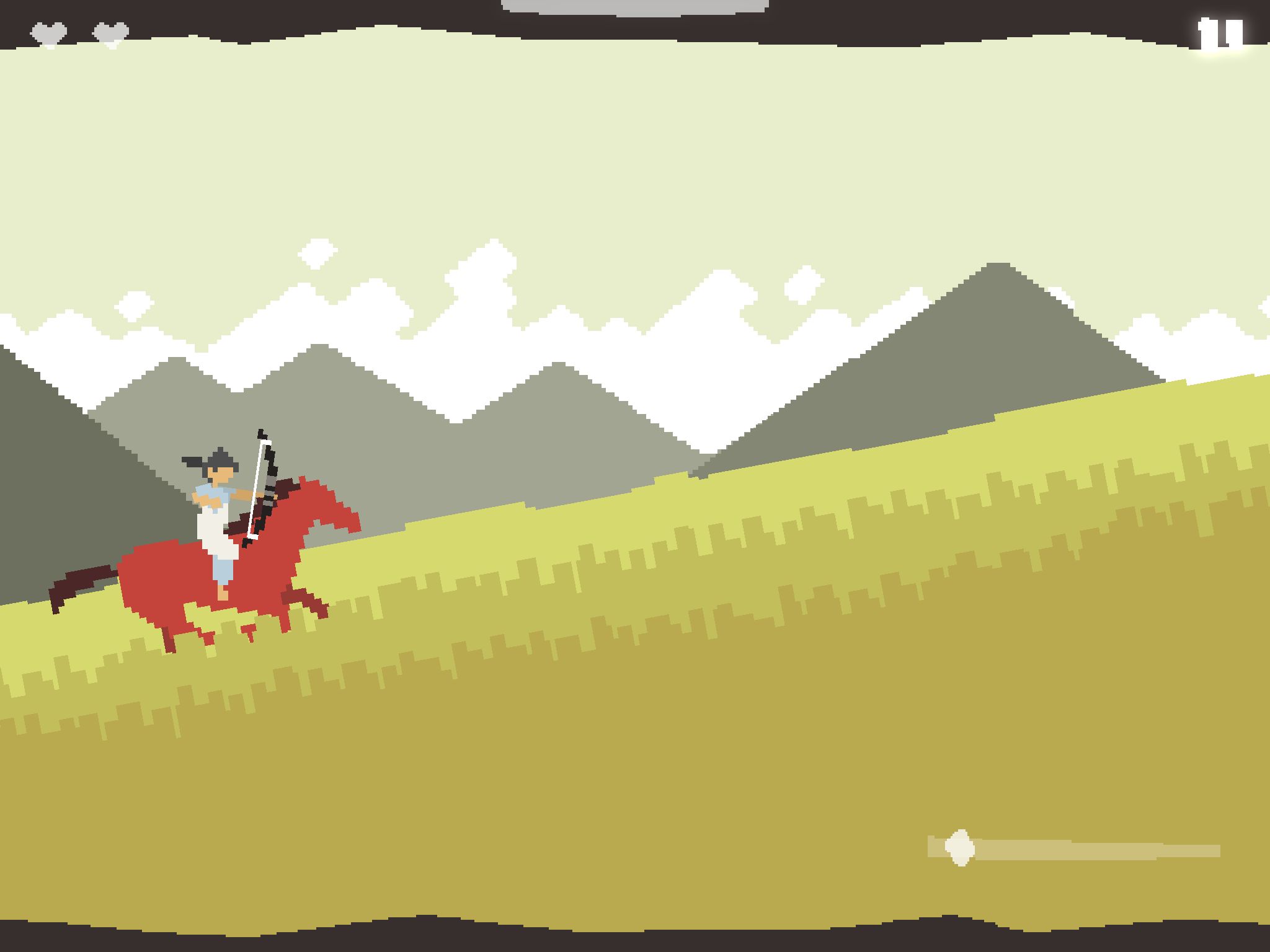
| the beautifully fresh and tranquil visuals of ARITM go over great on tablet. |
A Ride Into The Mountains is one of my favourite short games. As a demonstration of what can be done in mobile games in regards to keeping things simple, while demonstrating a high standard of "fun" it succeeds, for me, in many aspects.
The Game
So in ARITM you play as Zu as you travel through a cleverly rendered pixel-art world on his trusty (seemingly rotoscoped) horse. The fact that this is one of my favourite mobile games says a a lot about the gameplay and visual design because normally pixel art games, on a purely aesthetic level, do not grab my attention, and sort of get "thrown in the pile".
The game begins in the woods and as you would imagine ends in the mountains. Throughout the game you experience a full day cycle and as such this allows the game a great sense of scale and adventure. The night-time scenes especially, harness a very fresh colour palette, which translates very confidently into the pixel art. Unlike many pixel-art games which, in terms of artistic style, can come across very poorly due to a poor understanding of colour theory and pixel-art fundamentals.
The gameplay revolves the usual "angry birds" slingshot mechanic (and this does feel great on the iPad's large screen). However, where the game comes into its own is through its added dynamics of this mechanic, and others.
To start off with, almost the entire game is a frantic gallop, and as such grants it a very urgent, immediate feel. Which is awesome because this gives the player a strong sense of purpose. You don't get the chance to put it down. The player can also tilt the device to speed up and slow down. As the enemies circle around the player this becomes an exciting addition to the game play and also a nice balancing act of dodging and striking.
The Art
Colour, Scale,
Colour (and mood) plays a strong role in this game and at times reminds me of the critically applauded "Swords & Sworcery". As I touched on before, the desaturated colours emphasise the grandeur and importance of the games narrative. This is no place for primary colours in this game. Except for the bright red horse of course, which acts as a great contrast to the environment throughout.
Game Ideas.
So the game idea was a fusion between my own idea, and the idea of our programmer.
So because we only have a few weeks to not just create this game, but hopefully apply some level of polish, we took a very a "Less is more" approach to both the game design and proposed art style.
Basically we all admired the cleanliness of games like ARITM, and in turn wanted our game to also have a sophisticated, fresh feel to it.
The gameplay transpires from the Rube Goldberg idea of cause and effect mechanisms. The games' character will move independently and it will be up to the player to alter the Goldberg influenced environment to correctly guide the character to the end of the levels.
Their is only one "character" in the game at the moment.
-The Moon.
At the beginning of the levels you see the moon resting in the sky. The player witnesses the Moon fall from the sky into the level - and the game begins.
The goal is to clear a path to allow the moon to roll effortlessly through the level and rise as the sun upon completion.
As for the length of the levels, that remains to be decided. And our designer is currently working on creating interesting level structures.
There are a few artistic methodologies/theories that I would like to consider for the art creation and level design of the game.
The first one stems from a diagram in Chris Solarski's book "Video Game Art and Drawing Fundamentals", which notes the idea of harmony and dissonance in video games.
“Soft, rounded shapes are the obvious choice for designing an environment of natural, organic beauty. But you need an element against which to measure this beauty”
I feel this could benefit our levels as our character is simply... a circle. And it would quickly become obvious the sense of dissonance if our environment began to evolve as the levels progess.
So for the past few days I've been experimenting with visuals styles and shapes to try and find a nice environment for our games' context.
 |
| Early Visual Development |
So aside from the moon, everything else is purely for test purposes - nothing close to finished.
Also the "Move" is just a working title I came up with. More on that later.
I think that should do it for now,
more to come soon.


No comments:
Post a Comment