
 |
| Old Plan |
So the new plan has:
-My Logo
-Character Sketches > Final Designs
- Silhouettes
-Fundevogel Story (Maybe)
-MY BOOK!
-Sketchbook (the brown thing)
- ONE clay statue. Polished. (As opposed to two average ones)
-Business Cards.
Earlier in the project, I expressed a desire to have the design process to be the exposition. So at the top you would have thumbnails and early sketches, then working down through final designs, environments, and then a clay model at the end.
However, I feel the book is going to do this task in a far more tangible and intimate way.
So for impact, I will now be having mainly finished pieces on the wall itself. Much like the front cover of the book is a final design, and then within lies the sketches; the wall will grab the attention of people with final designs, and then the book will show the process.
Golly, I really hope the book arrives in time.
I might have one of my environment paintings instead of the silhouette sheet, because that would probably look better in a big print. However, this is obviously just the plan. I'll probably mess around with it more when I get to actually put it up. As for wallpaper/background design. I'm quite a fan of just plain white backgrounds. And there's a reason for this.
Throughout the year I went and visited exhibitions to witness different ways in which people display their art. Although the ones I visited didn't directly relate to my project in any way, the idea of emphasis, clarity, and process are all factors important to my exhibition, and were apparent in the ones I visited.
The Rock Photography of Harry Papadopoulos an exhibition that is currently on at the McManus. The simplicity of this exhibition was something I really admired. All black and white photographs on a white background. The photographs really stood out against the white and demanded your attention. I really want the only focus of my wall to be the artwork. Originally, I had planned to have some form of wallpaper behind the art. But then I guess that was just an impulsive decision for novelty. I think my logo and name at the top should frame the exposition well enough. However, I might be tempted to put a subtle pattern around the edges of the wall to frame it even further.
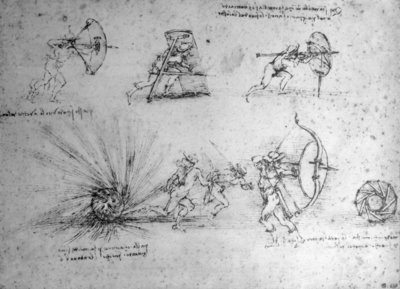
I also visited the Da Vinci exhibition months ago at the McManus, and thoroughly enjoyed it. (A favourite piece being the bow/shield).
I'm going to try and get some matte black frames for the character designs and some boards for the other paintings to give them a bit of authority. I think it's probably fair to say my presentation skills have grown a bit in the past 9 months.
Also here's the layout for my Book. It's 46 pages long. I think that should be a fine length. In my opinion, it clearly shows the development process for my characters, environments, and my personal development. So I hope the visitors get to experience that too.
Also, this was before I added any DARE art to it. Thus why there's only 40 pages long in this image.
 |
| New Plan! |
However, I feel the book is going to do this task in a far more tangible and intimate way.
So for impact, I will now be having mainly finished pieces on the wall itself. Much like the front cover of the book is a final design, and then within lies the sketches; the wall will grab the attention of people with final designs, and then the book will show the process.
Golly, I really hope the book arrives in time.
I might have one of my environment paintings instead of the silhouette sheet, because that would probably look better in a big print. However, this is obviously just the plan. I'll probably mess around with it more when I get to actually put it up. As for wallpaper/background design. I'm quite a fan of just plain white backgrounds. And there's a reason for this.
Throughout the year I went and visited exhibitions to witness different ways in which people display their art. Although the ones I visited didn't directly relate to my project in any way, the idea of emphasis, clarity, and process are all factors important to my exhibition, and were apparent in the ones I visited.
The Rock Photography of Harry Papadopoulos an exhibition that is currently on at the McManus. The simplicity of this exhibition was something I really admired. All black and white photographs on a white background. The photographs really stood out against the white and demanded your attention. I really want the only focus of my wall to be the artwork. Originally, I had planned to have some form of wallpaper behind the art. But then I guess that was just an impulsive decision for novelty. I think my logo and name at the top should frame the exposition well enough. However, I might be tempted to put a subtle pattern around the edges of the wall to frame it even further.
I also visited the Da Vinci exhibition months ago at the McManus, and thoroughly enjoyed it. (A favourite piece being the bow/shield).
I'm going to try and get some matte black frames for the character designs and some boards for the other paintings to give them a bit of authority. I think it's probably fair to say my presentation skills have grown a bit in the past 9 months.
Also here's the layout for my Book. It's 46 pages long. I think that should be a fine length. In my opinion, it clearly shows the development process for my characters, environments, and my personal development. So I hope the visitors get to experience that too.
 |
| It looks like Page 8 is blank, but it just hadn't finished buffering. That's where Fundevogel's final design is. |
No comments:
Post a Comment